Trend colors for decoration in 2026: innovation and style with Krion® LUX
21/08/2025 [Updated on 30/12/2025]
The world of decoration is constantly evolving, and the sociological and cultural changes we are experiencing are profoundly influencing design trends for 2026. As consumers become more aware of the environmental, social, and economic issues affecting the world, they are looking for solutions that are not only aesthetically appealing, but also responsible and sustainable. This shift towards greater responsibility, both on a personal and collective level, is directly reflected in the color choices for the coming years. Consumers in 2026 will be more future-focused, demanding that brands and products align with values of sustainability and change.
In this context, according to the consulting firm WGSN:
"2026 will be the year of redirection, where old ideas will be questioned and consumers will demand urgent change in the way we treat our societies, organize our industries, and cooperate with our environment."
This call for collective action will have a direct impact on color preferences, as consumers will choose shades that reflect this mindset of transformation and resilience. In fact, according to data from the same consulting firm:
"98% of consumers say that color influences their purchasing decisions."
This data highlights the importance of how colors can play a crucial role in connecting emotionally with consumers, becoming an essential tool in building the identity of brands that promote sustainability and change. That is why the colors that will dominate the 2026 palette will not only evoke beauty, but also convey a message of change toward a more responsible world.
What will you discover in this article about the colors that will be trending in 2026?
- Trending colors for 2026
- Discover how to apply the trending colors to your projects
- The psychology of color by Johann Wolfgang von Goethe
What will be the trending colors in decoration for 2026?
In 2026, the color palette will be characterized by a fusion of warm, natural tones, such as terracotta and earth tones, which continue to gain prominence in interior design. These colors evoke a deep connection with nature, bringing warmth, stability, and a sense of well-being to spaces.
On the other hand, we will see the emergence of more vibrant and intense colors, such as fuchsia and other shades that will bring dynamism and energy. According to WGSN:
" These shades reflect an era of transformation and adaptation, contrasting with softer, more natural colors. This combination of warm and vibrant tones will form a rich and balanced palette that responds to the need for renewal and emotional connection, adapting to both calm spaces and those that seek to awaken intense and refreshing sensations."
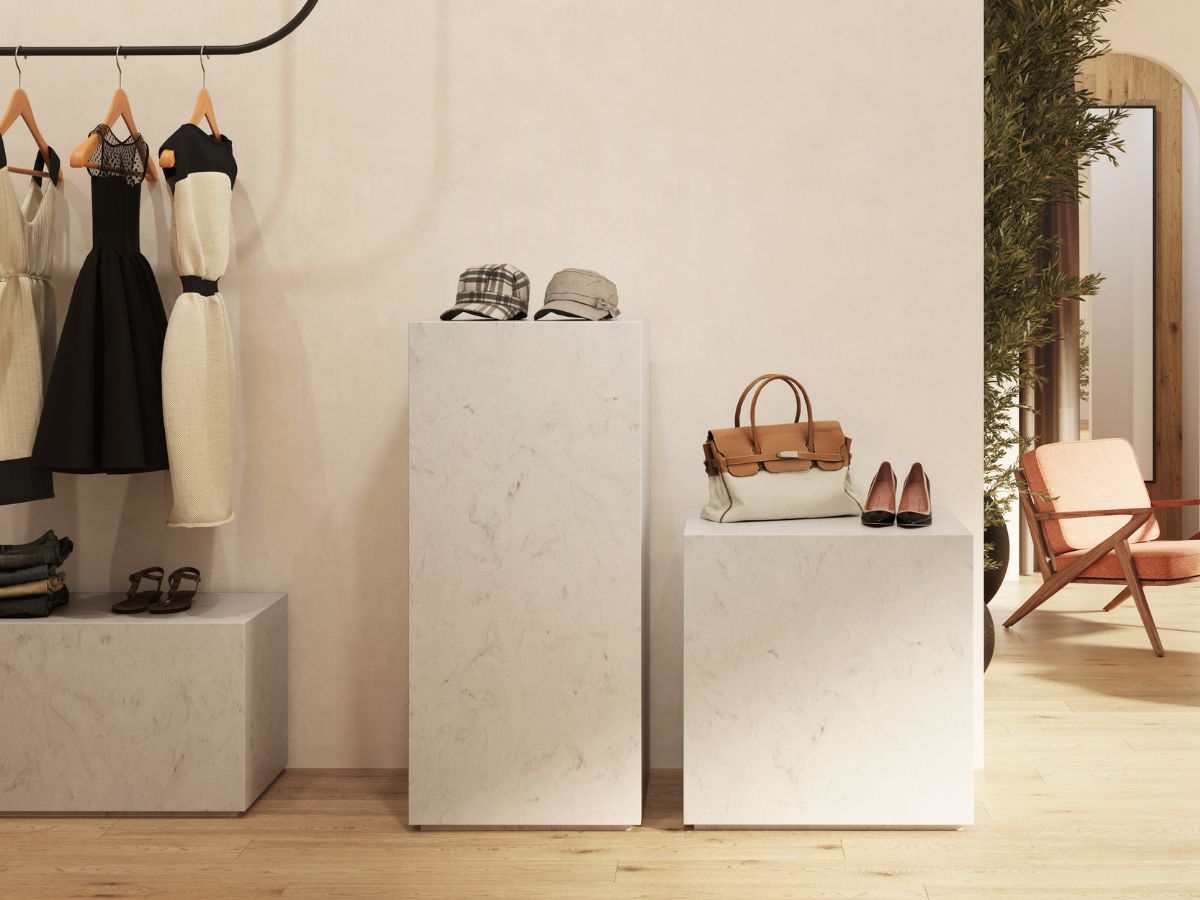
Warm and natural colors: the terracotta and earth palette that will dominate 2026
In 2026, warm, natural colors such as terracotta and earth tones will dominate interior design, reflecting a return to authenticity and nature. After years of sensory overload, these shades help to create welcoming and balanced spaces, promoting emotional well-being and offering refuge in an increasingly fast-paced world. This change also reflects the growing need to find peace in the genuine and simple, and responds to the desire to connect with the environment.
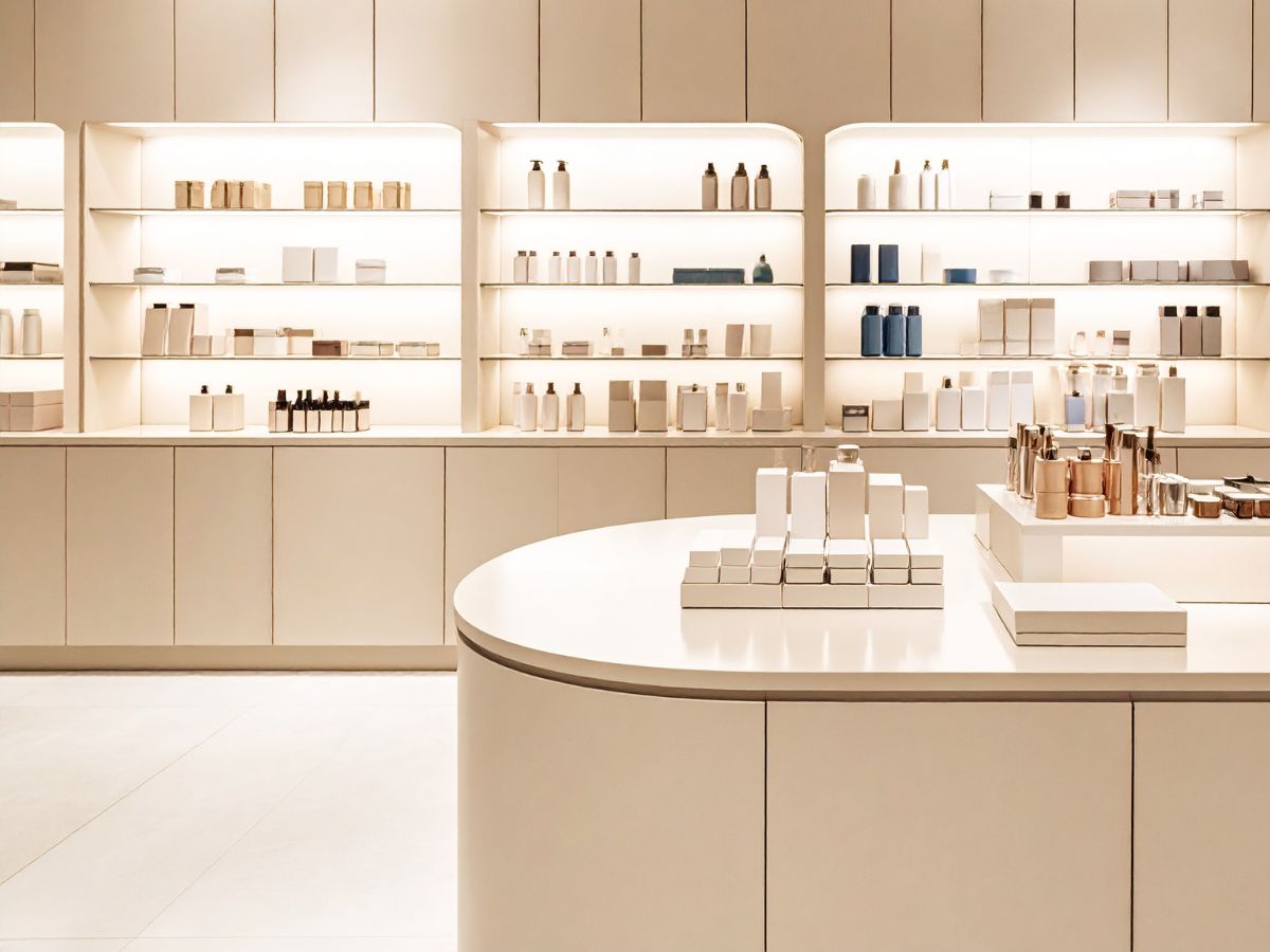
This palette works exceptionally well in spaces such as bathrooms and kitchens, where its main advantage lies in its ability to harmonize with wood, brushed metals, stone, and natural textiles within an architectural setting characterized by clean lines. In this new collection, the earth tones break away from their rustic heritage to adopt a purely contemporary and architectural character; their use becomes more refined, applied to wall cladding, countertops, shower trays, and furniture to create an enveloping visual continuity.
With Krion® LUX, this chromatic approach translates into surfaces that allow the material to complement the design without compromising on the highest technical performance. The visual warmth of these shades is enhanced by non-porous textures that are pleasant to the touch, designed for intense daily use. Thus, while the bathroom fosters an atmosphere of absolute relaxation, the kitchen offers balance and a sense of warmth, ensuring in both cases an aesthetic that ages gracefully—an indispensable quality in both residential projects and the hospitality sector.
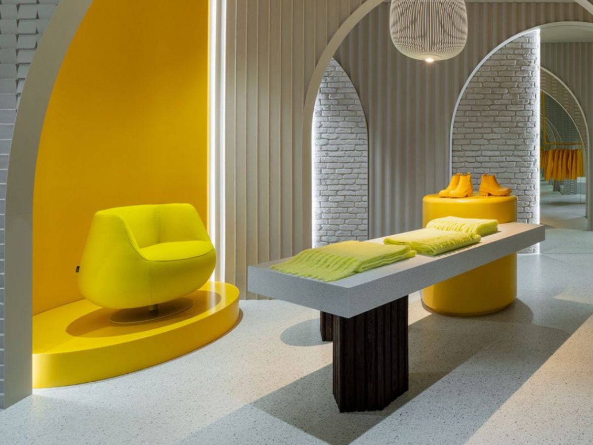
Intense and vibrant colors: the impact of fuchsia and other transformative shades in 2026
In contrast to warm tones, more vibrant and daring colors, such as the greenish blue Transformative Teal, the fluorescent pink Electric Fuchsia, the pastel grayish blue Blue Aura, the yellowish amber Amber Haze, and the mint green Jelly Mint, will dominate the trends of 2026. According to WGSN, these colors embody the spirit of transformation, driven by the urgency to address social and environmental challenges.
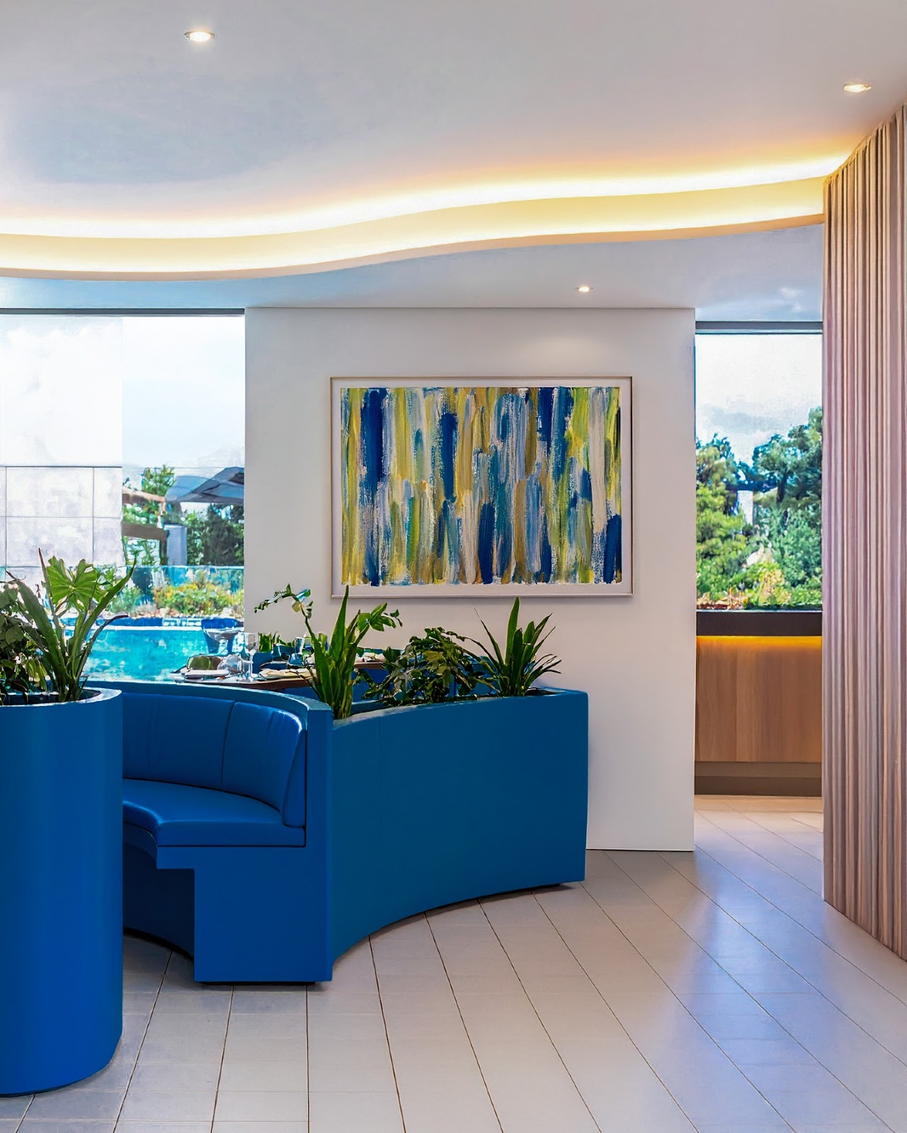
Transformative Teal, in particular, reflects an eco-responsible mindset and a shift in perspective on the climate crisis, merging blue and green into a symbol of nature and sustainability. These colors are associated with creativity, resilience, and the need to adapt in an era marked by change, offering energy and dynamism to spaces that seek to empower and stimulate action in the face of contemporary challenges.
How to apply trend colors in your decorative projects
Applying the trend colors of 2026 in decorative projects involves understanding the needs of the space and the emotional impact that colors have on users. Colors not only define the aesthetics of a project, but are also key tools for creating functional environments that respond to the current values and desires of consumers.
Tips for integrating trend colors into your decorating projects
Applying the trend colors of 2026 to your decorating projects requires careful thought about how each space can benefit from these shades, creating environments that are both functional and attractive. Here are some practical tips for integrating them effectively:
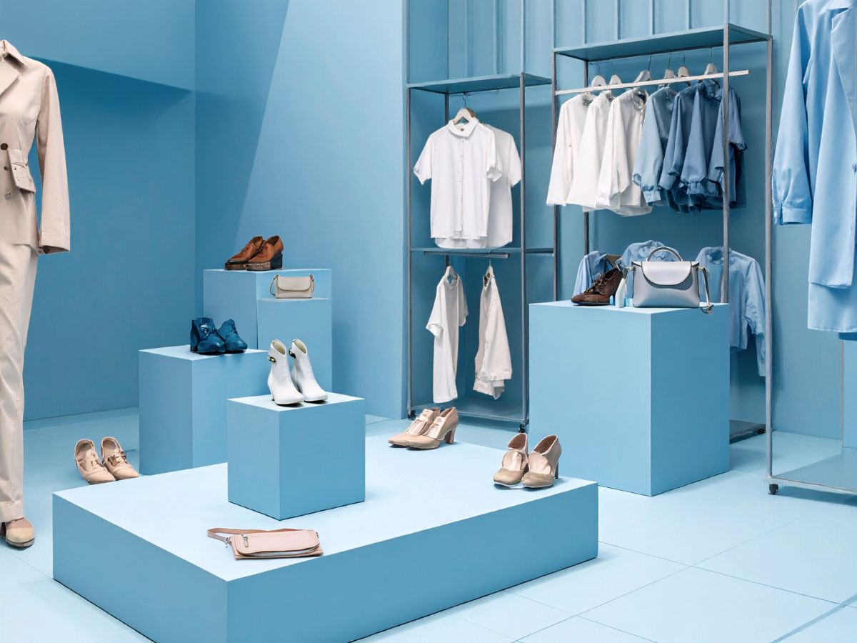
- Walls: painting an accent wall is one of the easiest ways to incorporate vibrant colors into a space. You can paint a key wall to create a focal point that attracts attention without overwhelming the room. Meanwhile, the main walls can be kept in more neutral or soft tones to provide balance and create a harmonious background. This combination allows you to create interesting contrasts that are visually stimulating without losing overall coherence.
- Furniture: Furniture is essential for defining the style of a space. In commercial, hotel, and restaurant projects, you can apply vibrant colors to key pieces such as counters, work tables, chairs, or side tables. These pieces can become focal points that bring character and energy to spaces. To maintain balance, use more neutral or natural tones on other pieces of furniture, such as cabinets, shelves, or benches, creating a solid and welcoming base without colors clashing with each other.
- Accessories: Accessories offer unique flexibility for incorporating color without compromising the functionality of the space. Cushions, rugs, lamps, curtains, and small decorative details such as vases, paintings, or mirrors are excellent for adding color without making a permanent commitment. They are ideal for bringing a touch of freshness and dynamism to any environment and can be easily changed if you want to update your decor in the future.
- Color combination: The key is to balance vibrant tones with softer, more natural ones. Use bold colors to highlight key areas, such as an accent wall, countertop, or work table, while calmer colors should predominate in the main areas of the space. This combination ensures that colors complement each other and maintains a harmonious visual flow, avoiding an overwhelming atmosphere.
How colors influence the perception of space
Color psychology, largely influenced by Johann Wolfgang von Goethe's color theory, studies how colors affect our emotions and behaviors. Goethe was one of the first to explore how colors not only have physical properties but also a profound emotional impact. Unlike contemporary scientific theories that focused on the physics of color, Goethe analyzed the subjective effects of colors on people.
According to his theory, warm colors such as red, orange, and yellow generate feelings of energy and dynamism, while cool colors such as blue, green, and violet evoke calm and reflection. Goethe also noted that bright colors, such as yellow, could induce joy, while darker tones, such as black and brown, often evoked elegance.
In the field of interior design, this understanding of color psychology allows architects and designers to create environments that are not only aesthetically appealing but also elicit an appropriate emotional response. For example, in commercial spaces or hospitality settings, where interaction and dynamism are sought, warm colors can be used in key areas, such as counters, walls, or furniture, to stimulate energy and create a welcoming atmosphere. On the other hand, cool colors are ideal for spaces where tranquility and concentration are desired, such as hotel bedrooms or work areas, as they help reduce stress and promote relaxation.
Neutral colors, such as white and gray, play a crucial role in balancing the space, providing a base that highlights other tones without visually overloading the environment. By applying Goethe's theory, designers can influence the perception of space, using colors to visually enlarge or reduce dimensions, as well as evoke emotions in those experiencing the environment.
Professional tips for choosing trendy colors for projects
Choosing the right colors for a decorative project is crucial to creating the desired atmosphere, and architects and interior designers must take several factors into account. Here are some key tips for integrating the color trends of 2026 into your projects:
- Know the space and its purpose: Before choosing a color, it is essential to understand the purpose of the space. For example, for offices and workspaces, colors that promote concentration, such as cool tones, may be ideal. On the other hand, for commercial spaces or areas of social interaction, warm colors may be more appropriate to generate dynamism and energy.
- Think about color psychology: Make sure you understand how colors affect people emotionally. Use these psychological effects to enhance the user experience within a space.
- Consider natural and artificial lighting: light plays a fundamental role in how colors are perceived. Colors can look different depending on the amount and type of light the space receives. It is advisable to test color samples in the same environment before making final decisions.
- Combine neutral colors with vibrant accents: While neutral and natural colors serve as a base and allow other design elements to stand out, vibrant hues can be used to create focal points. Don't hesitate to incorporate pops of color in furniture, architectural details, or accent walls.
- Think about durability and maintenance: Some colors may be more practical for certain areas of the project.
- Maintain consistency with the brand identity: If you are working on a commercial or hospitality project, the colors chosen should be aligned with the brand identity or the experience you want to convey. Colors should complement the brand's philosophy and strengthen its presence in the space.
When integrating the color trends of 2026 into your projects, it is essential that the colors selected are not only in line with current aesthetics but also reflect the values and identity of the brand. In this sense, Krion®, with its wide range of colors, allows architects and interior designers to create spaces that are not only visually striking but also aligned with the perceptions of the projects.
Frequently asked questions about color trends in decoration in 2026
What colors will be trending in interior design in 2026?
In 2026, color trends will be dominated by a mix of natural and vibrant tones. According to WGSN, trending colors include Transformative Teal (a blue-green), Electric Fuchsia (a fluorescent pink), Blue Aura (a pastel gray-blue), Amber Haze (a yellow amber), and Jelly Mint (a mint green). In addition, terracotta tones and earthy colors will continue to set the tone, bringing warmth and a connection to nature.
In addition to these shades, terracotta and earth tones continue to dominate, setting the tone by bringing warmth and an intrinsic connection to nature. This year’s overall trend combines visual calm with a strong dose of personality; the goal is not a constant explosion of color, but rather a thoughtful balance where every shade serves a clear purpose within the space.
How can I use sustainable colors in my decorating projects?
Applying sustainable colors to your decorating projects starts with choosing natural shades that evoke a connection to the earth, such as greens, grays, and browns. To do this effectively, you can paint the main walls in these neutral tones and add vibrant accents in details such as furniture and accessories. It is also important to consider using eco-friendly and sustainable materials to ensure that colors are not only visually appealing but also environmentally responsible, such as Ecocycle® models.
Why choose Krion to follow the color trends of 2026?
Krion® is the ideal choice for following the color trends of 2026 thanks to its wide range of colors, which includes a variety of vibrant and natural shades that align perfectly with current palettes. This material not only offers aesthetically versatile options, but also stands out for its exceptional properties.
Thanks to its strength and durability, colors applied to Krion® maintain their intensity and finish for longer. This makes it an ideal choice for commercial, hotel, and interior design projects, where aesthetics must be long-lasting and remain flawless over time. By choosing Krion®, designers not only follow color trends, but also ensure that their creations are resistant, sustainable, and long-lasting.